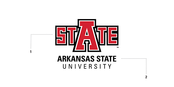
The University Logo is the cornerstone of the Arkansas State University identity system. As the primary identifier of the university, the University Logo has been developed to consistently represent the university in all of its communications.
Over time, consistent and repeated use of this mark will establish equity and strengthen the greater visual identity of the institution. To ensure consistency, however, it is critical for every user of the University Logo, regardless of personal preference, to use it in accordance with these guidelines.

The University Logo consists of two components: the STATE Logo and the University Wordmark. Each of the individual components maintains a special relationship to the others and must not be altered.
The STATE Logo
Why the STATE Logo?
The STATE Logo is our most beloved and visible symbol. It plays a vital role in promoting Arkansas State University by providing a strong and recognizable graphic image that creates a great sense of pride and connection among all generations of the Arkansas State community.
History of the STATE Logo
The block STATE logo was sketched/designed in the mid-1970s by Matt Melzer, a student manager from Monticello, Ark. His drawings were placed in a desk drawer and seemingly forgotten about until Head Football Coach Larry Lacewell needed a new logo in the early 1980s. The Melzer logos were stumbled upon and submitted. From the very start this image was readily accepted by most everyone.
The STATE logo has seen only a few changes/updates over the last 30 years and is widely considered to be one of the most bold institution marks in the country. It is set in two colors – ASU Red (PANTONE© 186) and Black.
The University Wordmark
The words underneath the STATE logo are called the University Wordmark and have been carefully considered to form the University Logo. A simple, clean, condensed sans serif font in all-caps was selected for its even stroke weights.
This font helps to enhance the STATE mark rather than compete for its attention. Using an approved university typeface the words “ARKANSAS STATE” are keyed in a slightly larger point size and weight than the word “UNIVERSITY.”
Also, the first two words are always kept together on the same line. The word “ARKANSAS” should never attract more attention than the word “STATE” no matter what the configuration.


